Now that Android is the leading operating system used to connect to the Internet, technical writers need to seriously look at how their content is being displayed on smartphones and tablets.
For years, smartphone and tablet use has skyrocketed. In 2016, the number of smartphone users was expected to surpass 2 billion (source: eMarketer). Similarly, there are about 1.5 billion people who are expected to use a tablet by 2019 (source: eMarketer). Earlier this year, Android has edged out Windows as the number one operating system used to access the Internet.
Meanwhile, technical writers appear to be slow to embrace mobile. In one study completed last year of more than 700 technical communication professionals, only 24 percent of technical writers publish content that would be considered “mobile ready.”
Although there may be an undeniable user demand for everything mobile, preparing content has its share of challenges.
Challenge Number One: Small Screen
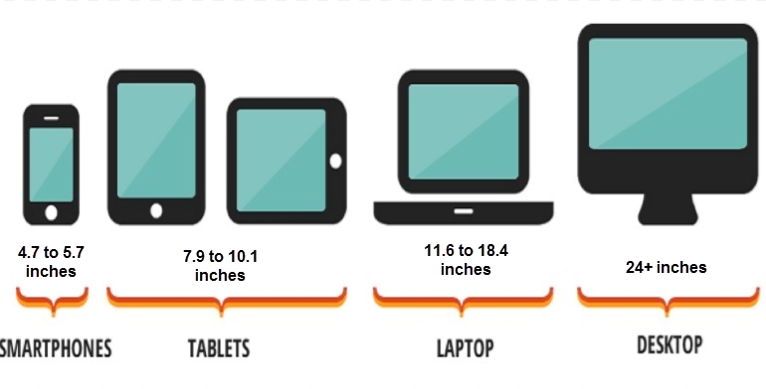
In spite of the modern trend towards larger-screen phones, what makes mobile phones so convenient and portable is their small size. Compared with desktop and even laptop screens, phone screens accommodate a lot less content—see the following illustration comparing the sizes of monitors, tablets, and smartphones.
As a result, mobile users must work harder to access the same information and rely on their short-term memory to refer to information that is not visible on the screen.
One way to mitigate users’ small screens is to embrace brevity. One usability consultant recommended that if you write 100 words for a print-based document, consider writing 50 words for the web. For mobile, aim to reduce the word count even more.
Challenge Number Two: Comprehension
Jakob Nielsen, a usability consultant, has performed some studies on user comprehension levels on mobile devices.
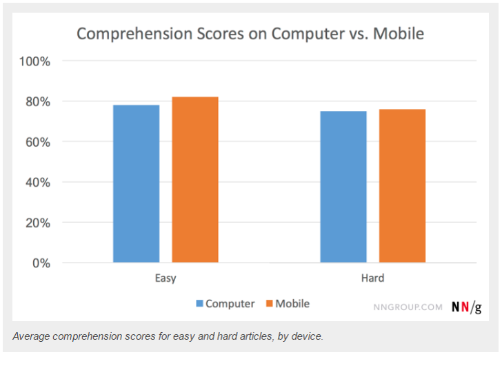
In a recent study, he found that, on average, comprehension scores were slightly higher when users read the articles on mobile devices. However, difficult content may cause lower comprehension on mobile.
The difficulty of the articles (“easy” or “hard”) was determined by the number of words and the difficulty of the language used (according to the Flesch-Kincaid reading-level formula). All of the articles were presented as HTML pages created from the same simple design template.
Easy passages were read about as fast on both devices, but hard passages actually took longer to read on a mobile device versus a computer. Easy articles were about 400 words and written at a Grade 8 level. Hard articles were just under 1,000 articles and at a Grade 12 level.

I would argue that technical communication would typically fall into the hard category.
The takeaway for me is again to simplify your content and to get to the point. You’re asking a lot if you write a 1,000-word article when you know that some users will be reading the content on a 5‑inch screen.
Challenge Number Three: Distraction Levels
Smartphones have revolutionized how we live. But as mobile phones are portable, we are more likely to be interrupted when using them. Nielsen notes that the average user may be using a desktop for more than 150 seconds while the average mobile session duration is just 72 seconds.
Nielsen recommends:
- Allow users to save history, as well as to email or share information with themselves or others.
- Prioritize what is essential on a page and simplify tasks and interactions. Because attention is fragmented, strive to show users what they need as soon as possible.
As users are more and more likely to read technical communication on a mobile device, it’s an exciting time for technical writers to learn new skills and approaches.


 I have worked as a