As FrameMaker is an authoring tool made for technical writers, you might think that its help would be exemplary—a showcase of the tool’s capabilities that would inspire other writers to perform their best work.
Clearly, the Adobe technical communication group does not share that vision. When I launched FrameMaker’s help to search for clarification on its new feature that enables authors to publish to online help (without RoboHelp), I felt disappointed.
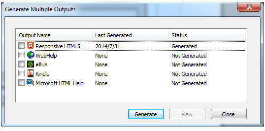
First, the image quality of the screen captures is so poor that I found myself squinting to decipher them. From the “Multichannel publishing” help topic, here are two examples of pixelated graphics:
In addition, I felt disappointed because the “Multichannel publishing” help topic is so long—it is 27 pages when copied to a Word file! A few suggestions:
- Chunk the content: With a sea of text and a handful of pixelated graphics (some of which are misaligned), it is overwhelming. I’d split the content into sub-procedures to make the content easier to digest.
- Reduce the text: Believe it or not, the “Multichannel publishing” help topic contains almost 7,000 words. When writing content that will be read online, aim to reduce the word count by 50 percent. That means if you write a document that is meant to be printed and it is 1,000 words, consider writing 500 words for an online document. Without a doubt, I’m sure that the content could be more concise. For more information about these guidelines, see Ruthlessly edit when writing for mobile.
I usually don’t go out of my way to be critical of other technical documentation. If you want to create online help that is not outstanding, that’s your choice. But perhaps the Adobe writers could at least strive for clear and concise?

 I have worked as a
FrameMaker help has never been very good. Not something they have ever invested a lot in