Newer Help Authoring Tools such as Madcap Flare or Adobe RoboHelp will quickly create an EPUB file that includes a title page, table of contents, and the topics that you authored. If you don’t mind opening the EPUB file after authoring it in a Help Authoring Tool, editing the Cascading Style Sheet (CSS), you can gain a lot more control over the formatting of the file.
In this blog entry, I’ll briefly explain how to unzip the EPUB file and edit the CSS so that you gain more control over page breaks. In March, I spoke about formatting EPUB files using a CSS at the WritersUA conference.
A few basics
An EPUB document is a zip file with the .epub extension. EPUB files can be read using e‑reader software on a myriad of devices including the iPad, iPhone, PCs, and smartphones running on Android.
For technical writers, I believe EPUB files are one of the technologies to watch. The iBooks bookstore sells its ebooks in an EPUB file format. With tablets and smartphones forecast to outsell PCs in the future, users will increasingly be reading content—including technical communications—on these devices.
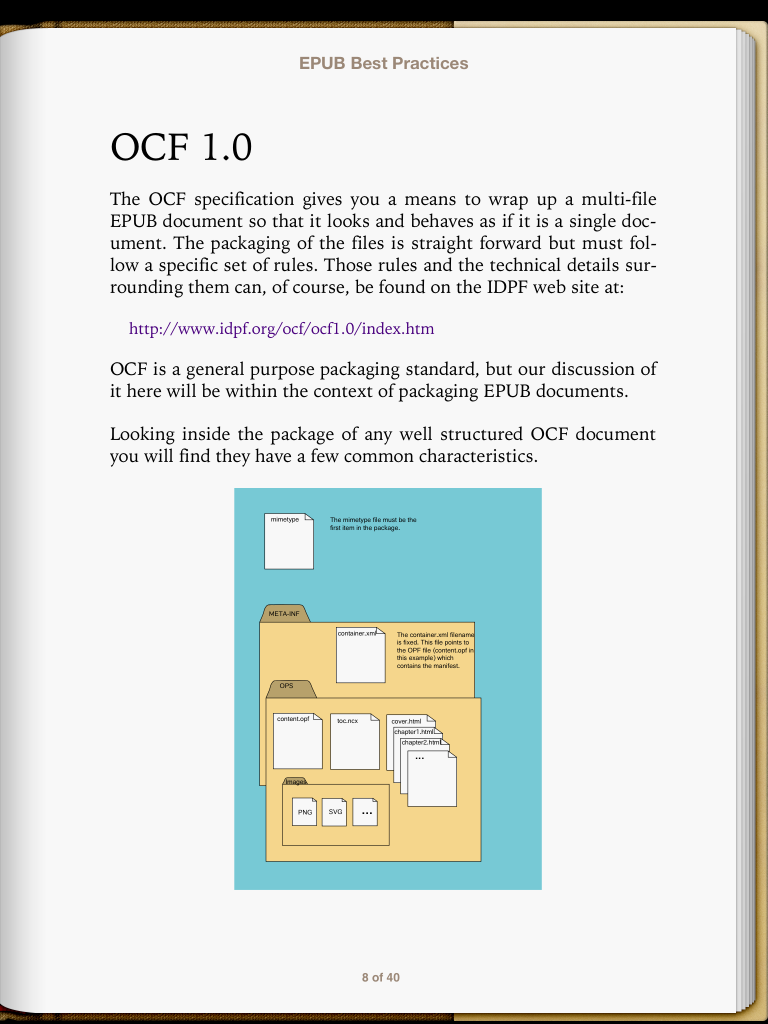
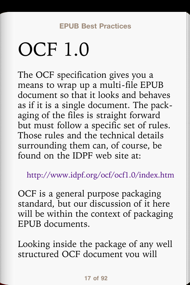
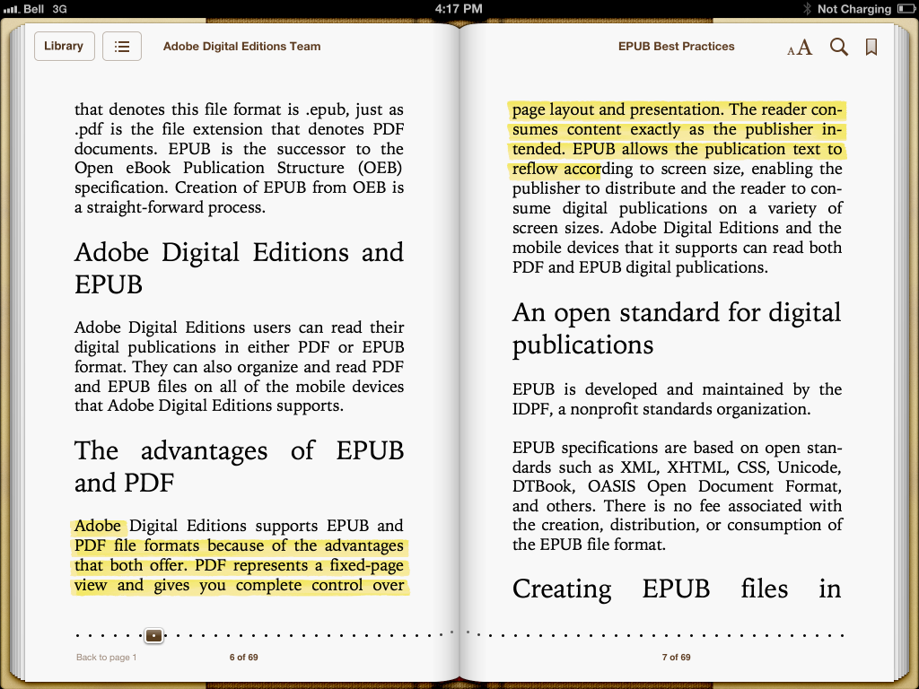
One of the key advantages of an EPUB file is its ability to reflow on different devices. The following image shows how an EPUB file appears on an iPad:
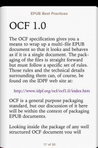
The next screen shot shows how the same file appears on an iPhone:
In contrast, a PDF file may look beautiful on your 24-inch monitor at home but is difficult to read on your smartphone.
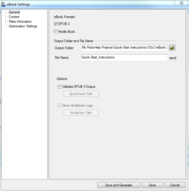
Controlling page breaks inside RoboHelp
If you work as a technical communicator, you probably use a Help Authoring Tool, such as RoboHelp or Madcap Flare. These tools provide a lot of the “heavy lifting” for you: they create the title page, a table of contents, and the topics themselves. You can use them to control some basic page breaks. But if more control is needed, edit your CSS.
Unzipping an EPUB
Complete the following steps to unzip your EPUB file:
- Locate your EPUB file.
- Change the .epub extension to .zip.
- Unzip the contents of the folder.
- Double-click the OEBPS folder (“OEBPS” stands for Open eBook Publication Structure).
- Locate the default.css file. This is your CSS file.
Using page breaks
Inside the CSS file add the following code using a text editor:
h2 {
page-break-before: always;
}
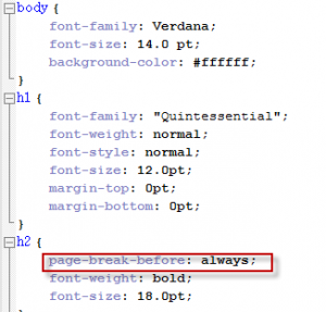
In the CSS, it might appear like the following image:
This first entry adds a page break before every instance of a heading 2. This might be useful if you want to insert a page break before a chapter title.
Here are some other options to consider:
- H3 {page-break-before: avoid;} This entry prevents an element (in this case, a heading3) to begin on a new page, unless absolutely necessary. You might want to use this code to try and ensure that content is grouped together.
- H3 {page-break-after: avoid;} This entry discourages a page break after an item.
- H3 {page-break-inside: avoid} This prevents an element such as a table or long list from being divided by a page-break. Keep in mind that if your table or list spans multiple pages, the e‑reader needs to create a break somewhere.
Next steps
After you make changes to the CSS, re-zip the EPUB project, rename so it uses an .epub extension, and test it on all the different e‑readers that your users may be using. I’ve installed Adobe Digital Editions on my computer and iBooks for the iPhone and iPad. Different e‑readers may render your EPUB file differently so testing is vital.
In future blog entries, I’ll explain how to control text alignment, widows and orphans, and fonts.
Additional resources
EPUB Straight to the Point
by Elizabeth Castro
Castro’s web site on formatting EPUB files:
http://www.pigsgourdsandwikis.com


 I have worked as a